
In late January and early February, monitoring groups and analysts circulated markedly different weekly totals for battlefield movement. In one widely quoted tally linked to the Ukrainian OSINT project DeepState, Russia’s gains in a late-January week were presented as unusually small, described by one outlet as just over 30 square kilometres. At the same time, other trackers produced higher estimates for comparable periods, while some summaries of ISW-derived mapping showed different weekly totals again.
The same divergence appeared in reporting about Ukrainian gains. A Reuters-cited analysis, carried by multiple outlets, put Ukrainian recaptures at about 201 square kilometres over several days in mid-February, calling it the most rapid territorial gain since Ukraine’s summer 2023 counteroffensive. Whether that figure becomes “the story”, however, depends on what is being measured and how control is defined.
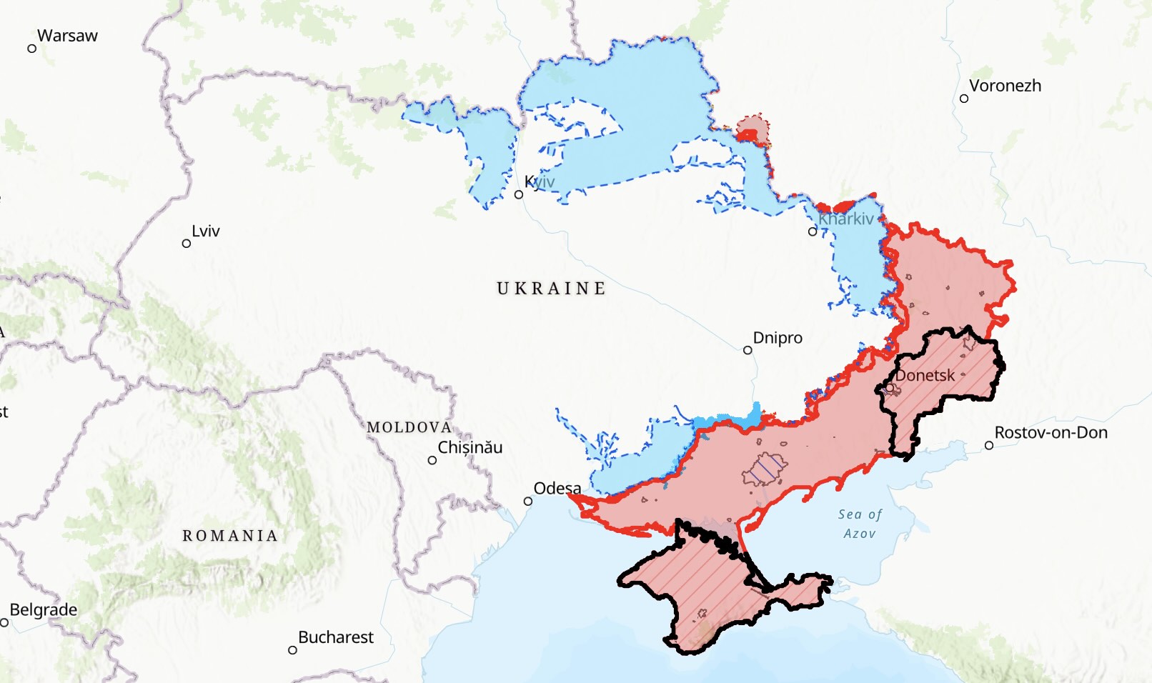
Frontline mapping in Ukraine is no longer a simple matter of tracing continuous trenches. Drone surveillance, dispersed infantry positions, and frequent infiltration tactics have expanded what many analysts describe as a “contact zone” rather than a single line. The Kyiv Independent has reported that “grey zones” on popular maps increasingly represent a wider area with overlapping positions and contested activity, rather than a narrow strip between fixed defences.
That matters because two maps can agree on where fighting is taking place yet disagree on when an area should be counted as “occupied” or “liberated”. Some trackers will wait for repeated confirmations before shifting a boundary; others may update earlier on the basis of geolocated footage, unit reports, or a pattern of withdrawals. In practical terms, this can move weekly totals by tens of square kilometres without either side necessarily making an error.
DeepState itself is widely used by Ukrainian audiences and international media. A Wikipedia summary of its stated approach describes a blend of geolocated photo and video evidence, reports from followers near the front, and confirmations from Ukrainian servicemen, with delays sometimes applied for operational security and verification. Because DeepState’s public map is heavily dependent on client-side scripts, it is not always possible for external readers to audit individual updates directly; coverage therefore often relies on DeepState’s own posts or media reporting of its figures.
ISW, by contrast, publishes daily narrative assessments and static “control of terrain” mapping, and it also maintains interactive products intended to show changes over time. Its public materials emphasise that these mapping products are updated regularly and complement narrative reporting, which frequently cites geolocated footage to substantiate tactical developments.
There are three common drivers of discrepancy.
First, the threshold for declaring control. If a village’s outskirts are entered by small groups but the centre remains contested, one tracker may depict a larger “grey” area while another shifts a control boundary. This is particularly acute where advances are made through infiltration rather than armoured thrusts, leaving pockets and bypassed positions behind.
Second, the treatment of “grey zone” space. Maps vary in how they delineate contested areas and whether that space is treated as neither side’s control, partial control, or a transitional buffer. The Kyiv Independent notes that what used to resemble a narrow no-man’s-land often now depicts a broader contact zone, reflecting the changing nature of the battlefield.
Third, time-lag and revision. Some organisations update cautiously, then revise; others move faster and correct later. Even a 48–72 hour lag can shift which incidents fall into a given “week”, especially during short, sharp counterattacks.
While precise weekly figures are contestable, several independent assessments point in the same direction: movement remains slow in absolute terms, and the pace fluctuates. A CSIS analysis published in January described Russia’s offensives as grinding and generally measured in metres per day in key sectors, shaped by attrition and the extensive use of drones that restrict manoeuvre. Russia Matters’ weekly “report card”, which compiles changes using open-source mapping data, similarly illustrates how gains vary widely from week to week even when the strategic picture changes only incrementally.
That context is essential when interpreting claims of a “ten-month low” for Russian advances or a “largest in two and a half years” Ukrainian gain. Both can be true within their own definitions, yet neither automatically indicates a decisive shift in operational momentum. In a war where control is often partial, contested, and revisable, the more reliable signal is consistency across multiple sources over several weeks, not a single headline number.
For Defence Matters readers, the practical takeaway is straightforward: treat weekly square-kilometre totals as indicators, not precise measurements. The question worth tracking is not only “how much territory changed colour”, but also how it was counted—and whether multiple independent methodologies are moving in the same direction.

Kellogg questions NATO and floats new alliance including Ukraine